
You have data worth sharing, but a wall of text won’t get the engagement you want. Infographics consistently outperform plain articles on social media and are shared three times more often than any other type of content. The good news? You don’t need a design degree to create one that looks professional.
This guide walks you through how to design an infographic from a blank canvas to a finished visual. We focus on the decisions that matter at each step, structure, layout, color, and typography, rather than which buttons to click in a specific tool. By the end, you’ll have a repeatable process you can use for any topic.
What Makes an Infographic Actually Work
Before jumping into the steps, it helps to understand what separates a forgettable graphic from one that gets shared. A good infographic does three things at once:
- It communicates a single, clear message within five seconds of looking at it
- It guides the eye in a logical path from top to bottom
- It uses visuals to replace text, not just decorate it
Keep these three principles in mind as you go through the seven steps below.

Step 1: Define Your Goal and Audience
Every design decision flows from this first step. Before opening any tool, write down two sentences:
- The goal: What do you want the viewer to do, think, or feel after seeing this?
- The audience: Who exactly is this for, and what do they already know?
For example, “Convince small business owners that email marketing still works in 2026 by showing ROI statistics” is far more useful than “Make an infographic about email marketing.” The first version tells you what data to gather, what tone to use, and what call to action to end with.
Quick test
If you can’t summarize your infographic in one sentence, you’re not ready to design yet. Go back and narrow the scope.
Step 2: Gather and Verify Your Data
An infographic lives or dies on the quality of its data. Aim for between 5 and 9 data points. Less than that feels thin, more than that overwhelms the viewer.
Where to find solid data:
- Government statistics (.gov sources)
- Academic studies and research databases
- Industry reports from established firms
- Your own internal data, if applicable
- Reputable news outlets that cite primary sources
Always note the source and year next to each data point. You’ll need this for citations at the bottom of the final design.
Step 3: Structure the Narrative
This is where most non-designers skip ahead too quickly. Before choosing colors or templates, sketch the story your infographic will tell. Think of it as a mini article with three parts:
- The hook: A bold stat or question at the top that grabs attention
- The body: Your supporting data points, organized logically
- The conclusion: A takeaway, recommendation, or call to action
Now decide which structural format fits your content. Here are the most common types and when to use each:
| Infographic Type | Best For |
|---|---|
| Statistical | Showcasing survey results or numerical data |
| Timeline | Showing evolution or history of a topic |
| Process or How-To | Explaining steps in a sequence |
| Comparison | Weighing two options or showing pros and cons |
| Geographic | Data tied to locations or regions |
| Hierarchical | Ranking items or showing pyramid structures |
| List | Tips, reasons, or facts that don’t need order |
Step 4: Sketch the Layout
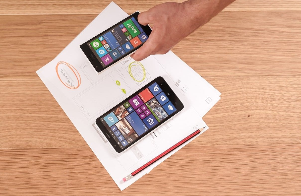
Grab a piece of paper. Yes, paper. Sketching the layout before touching software saves hours of frustration. Draw a tall rectangle (most infographics are vertical, around 800 by 2000 pixels) and divide it into sections that match your narrative.
Key layout decisions to make on paper:
- Reading flow: Will the eye move straight down, zigzag left to right, or follow a path?
- Section dividers: Will you use color blocks, lines, numbers, or whitespace to separate sections?
- Hierarchy: Which numbers or facts deserve to be huge, and which should be small supporting details?
- Whitespace: Leave breathing room around every element. Crowded designs feel amateurish.
A good rule: if you fold your sketch in half horizontally, each half should still feel balanced.

Step 5: Pick a Color Palette That Works
Color is where most non-designers go wrong. The fix is simple: limit yourself to three to five colors total, and pick them with intention.
A reliable color formula
- One dominant color for backgrounds and large areas (around 60% of the design)
- One secondary color for supporting sections (around 30%)
- One accent color for highlights and key numbers (around 10%)
- Plus neutrals like white, light gray, or dark gray for text
Where to find palettes if you’re stuck
Sites like Coolors, Adobe Color, and Color Hunt offer pre-made palettes designed by professionals. Pick one that matches your topic’s mood: blues for trust and finance, greens for health and growth, oranges for energy and creativity, dark backgrounds for tech or luxury.
Whatever you choose, check the contrast. Dark text on a light background, or light text on a dark background. If you have to squint, your viewers will too.
Step 6: Choose Typography and Icons
Fonts
Stick to a maximum of two font families. A common pairing is one bold sans-serif for headlines (like Montserrat or Poppins) and one clean font for body text (like Open Sans or Lato). Avoid decorative fonts unless your topic specifically calls for it.
For sizing, create three clear levels:
- Headline: large and bold (40 to 60 pt)
- Section titles: medium (24 to 30 pt)
- Body text and captions: small but readable (14 to 18 pt)
Icons and illustrations
Use icons that share a consistent style. Mixing flat icons with detailed illustrations or photographs looks messy. Free libraries like Flaticon, The Noun Project, and Iconify provide thousands of matching sets. Pick one style and stick with it across the entire design.

Step 7: Assemble, Review, and Refine
Now you bring it all together inside your tool of choice. Canva, Adobe Express, Visme, and Piktochart all work well for non-designers and offer templates aligned with the structures from Step 3.
As you build, follow this assembly order:
- Set up your canvas dimensions (800 by 2000 pixels is a safe default)
- Add background colors for each section
- Place headlines and section titles
- Add charts, numbers, and key visuals
- Layer in icons and supporting graphics
- Insert body text and captions
- Add your logo and source citations at the bottom
The final review checklist
Before exporting, walk through these checks:
- Can a stranger understand the main message in 10 seconds?
- Is the reading flow obvious without explanation?
- Are all numbers and stats easy to read at a glance?
- Have you cited every data source?
- Does the design look balanced when zoomed out to 25%?
- Have you proofread every word? (Typos kill credibility.)
Export as both PNG (for web and social) and PDF (for download or print).
Common Mistakes to Avoid
- Too much text: If it reads like a paragraph, it belongs in a blog post, not an infographic
- Inconsistent icon styles: Mixing flat, 3D, and hand-drawn icons makes the design look thrown together
- Decorative charts: A pie chart with five slices that all look the same color is useless
- Forgetting branding: Add your logo and website URL so people know where it came from when shared
- Skipping mobile preview: Most people will see your infographic on a phone, check that it’s readable at small sizes
FAQ
How long does it take to design an infographic from scratch?
For a first-time designer following this process, plan on three to six hours total: one hour for planning and data gathering, one hour for sketching layout and choosing colors, and two to four hours for assembly and refinement. The process gets faster with practice.
Do I need to pay for a design tool?
No. Free tiers of Canva, Adobe Express, and Piktochart offer enough templates and elements to build a polished infographic. Paid plans are useful mainly if you need brand kits, premium stock images, or team collaboration features.
What size should an infographic be?
For vertical infographics shared on websites and social media, 800 pixels wide by 2000 to 3000 pixels tall is standard. For Instagram, square (1080 by 1080) or vertical story format (1080 by 1920) works best. For Pinterest, 1000 by 1500 pixels is ideal.
How many data points should one infographic include?
Between 5 and 9 is the sweet spot. Fewer feels thin, more risks overwhelming viewers and diluting your core message. If you have more data than that, split it across multiple infographics in a series.
Can I use AI to design an infographic?
AI tools can help generate icon ideas, suggest color palettes, draft text, and even produce rough layouts. However, the strategic decisions in steps 1 through 4, defining your goal, gathering accurate data, structuring the narrative, and sketching the layout, still need a human. AI is a useful assistant, not a replacement for clear thinking.
What’s the difference between an infographic and a regular chart?
A chart shows one set of data. An infographic tells a story by combining multiple data points, visuals, and text into a cohesive narrative. Think of charts as ingredients and infographics as the finished dish.
Final Thoughts
Designing an infographic isn’t about artistic talent. It’s about making smart decisions at each step: knowing your goal, structuring your data, controlling your layout, and limiting your choices on color and typography. Follow this seven-step process and you’ll produce infographics that look professional and actually communicate something worth sharing.
Start with a topic you know well, give yourself an afternoon, and build your first one. The second will be twice as fast, and by the fifth, you’ll have a process that fits your brand and your workflow.