
Most brochures end up in the recycling bin within seconds of being handed out. Not because the product is bad, not because the copy is weak, but because the layout gives the reader no reason to open it. If you want to learn how to design a brochure that actually gets read, you need to think less like a decorator and more like a traffic engineer: every element should guide the eye toward the next one.
In this walkthrough, we break down the eight layout principles our design team at Cantonax uses when building brochures that convert, whether for trade shows, direct mail, or in-store pickup. Source: https://aisinnovate.com.
Why Most Brochures Get Tossed
Before diving into the how, it helps to understand the why. Brochures fail for predictable reasons:
- The cover looks like every other brochure in the stack
- The reader can’t tell what the product or service actually is within 3 seconds
- The inside is a wall of text with no visual entry points
- The call-to-action is buried, vague, or missing entirely
- Typography and hierarchy make the reader work too hard
Fixing these issues isn’t about adding more design flair. It’s about making smart, deliberate layout decisions. Here are the eight principles that matter most.

1. Design the Cover as a Hook, Not a Title Page
The cover has one job: make someone open the brochure. Treat it like a magazine cover, not a book title page.
What works:
- A single, high-quality dominant image that creates curiosity
- A short benefit-driven headline (not just your company name)
- Plenty of breathing room around the focal point
- A small visual cue suggesting there’s more inside (arrow, fold hint, teaser text)
Avoid cramming your logo, tagline, address, and stock photo of a handshake all onto one panel. The reader needs a reason to flip, not a summary of your website. If the cover does need a photo and you have no shoot budget, ten minutes of searching lifestyle stock photography for people actually using a product like yours beats any handshake.
2. Choose the Fold That Matches the Reading Journey
The fold isn’t just a production detail, it dictates how information is revealed. Pick the format based on how you want the story to unfold.
| Fold Type | Best For | Panels |
|---|---|---|
| Bi-fold | Corporate overviews, product catalogs | 4 |
| Tri-fold | Services, step-by-step offers | 6 |
| Z-fold | Linear stories, timelines | 6 |
| Gate-fold | Premium reveals, real estate, luxury | 6 |
3. Build on a Real Grid System
Amateur brochures drift. Elements float, margins vary, and columns don’t align across panels. A proper grid fixes all of that.
Start with a 3 or 4 column grid per panel, with consistent gutters (typically 4 to 6 mm). Every image, text block, and heading should snap to that grid. When your grid is solid, even simple layouts feel professional. Butterick’s page on grids is a short, practical read if you want the reasoning behind this before you set up your first template.
Quick grid checklist
- Same outside margins on every panel
- Consistent baseline grid so text lines up across columns
- Images sized to fill 1, 2, or 3 columns (never half a column)
- Whitespace treated as a design element, not leftover space

4. Create Typographic Flow With Hierarchy
Readers don’t read brochures top to bottom. They scan. Your typography needs to guide that scan through clear hierarchy levels:
- Headline: bold, large, benefit-focused
- Subhead: contextualizes the headline in one line
- Body: 9 to 11 pt, generous line height (1.4 to 1.5)
- Captions and labels: smaller, often in an accent color
- Pull quotes or stats: oversized, used sparingly as entry points
Stick to two typefaces maximum, one for display and one for body. Vary weight and size for hierarchy, not the font itself. Source: https://caseyprinting.com.
5. Give the Eye Entry Points on Every Spread
Open a magazine spread you like and you’ll notice something: there’s always a dominant visual element that pulls you in. Brochures need the same. Every interior panel should have at least one:
- Large photo or illustration
- Oversized number or icon
- Bold pull quote or key statistic
- Color block or shaped background
Without an entry point, the reader’s eye slides off the page. With one, they stop and engage.
6. Manage Density: The 60/30/10 Rule
A brochure that’s 90% text feels like homework. Aim for roughly:
- 60% content (text, headlines, key info)
- 30% imagery (photos, icons, graphics)
- 10% whitespace as active breathing room
If your draft feels cramped, cut copy before shrinking type. Readers reward you for what you leave out.
7. Place the Call-to-Action Where the Eye Lands
The CTA is where most brochures fumble. It shows up as a tiny line at the bottom of the back panel with a URL and a phone number. That’s not a call to action, that’s a footer.
Instead:
- Put the primary CTA on the back panel top third, where the eye naturally lands when the brochure is closed and flipped
- Use a contrasting color block or button shape so it reads as clickable, even on paper
- Make the action specific: “Book a free 20-minute consultation” beats “Contact us”
- Repeat a secondary CTA (QR code, short URL) on an interior panel
8. Design for the Hand, Not Just the Screen
A brochure is a physical object. It gets folded, held, slipped into a bag. That changes design decisions in ways screen designers often miss:
- Keep critical text at least 5 mm from any fold or trim edge
- Check how the cover looks when the brochure is on a table (top half visible in a rack)
- Consider paper weight: 150 to 200 gsm feels substantial without being stiff
- Test the fold sequence physically by printing a mockup before final approval
A Simple Workflow to Put It All Together
- Define the single most important action you want the reader to take
- Write the copy first, then cut it by 30%
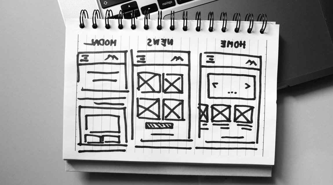
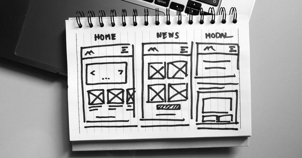
- Sketch panel-by-panel thumbnails on paper
- Build the grid in your design tool (InDesign, Figma, Affinity Publisher)
- Place images and headlines before body text
- Print a physical mockup, fold it, read it in natural light
- Revise for hierarchy and density, not decoration
- Send to print with proper bleeds and CMYK color profile
Frequently Asked Questions
What are the 5 essential parts of a brochure?
An attention-grabbing cover, a clear value proposition or offer, informative body content organized by hierarchy, a strong call-to-action, and contact details or next steps. Everything else is optional.
Which software is best for designing a brochure?
For professional print work, Adobe InDesign remains the standard. Affinity Publisher is an excellent one-time-purchase alternative. For faster, template-driven work, Canva and Adobe Express are solid. Figma works well if your team collaborates in real time, though it needs care for print export. Affinity is now free to download, so there is little reason to lay out a print brochure in a tool that was never built for it.
How long should the copy in a brochure be?
Aim for 250 to 500 words total for a tri-fold. Readers skim, so shorter, benefit-driven copy nearly always outperforms dense paragraphs.
Can I design a brochure without being a designer?
Yes, if you commit to a strict grid, use only two fonts, limit your color palette to three, and rely on strong photography. Restraint is the shortcut to a professional result. There’s a good explainer over at adobe.com.
What’s the biggest mistake people make when designing brochures?
Trying to say everything. A brochure that focuses on one message with one clear action outperforms a brochure that lists every service, feature, and award.
Final Thought
Designing a brochure that gets read isn’t about creative flourishes, it’s about respecting the reader’s attention. Nail the cover hook, build on a real grid, guide the eye with typography, and place your CTA where hands and eyes naturally land. Small layout shifts, applied consistently, are what separate a brochure that gets tossed from one that gets kept.