
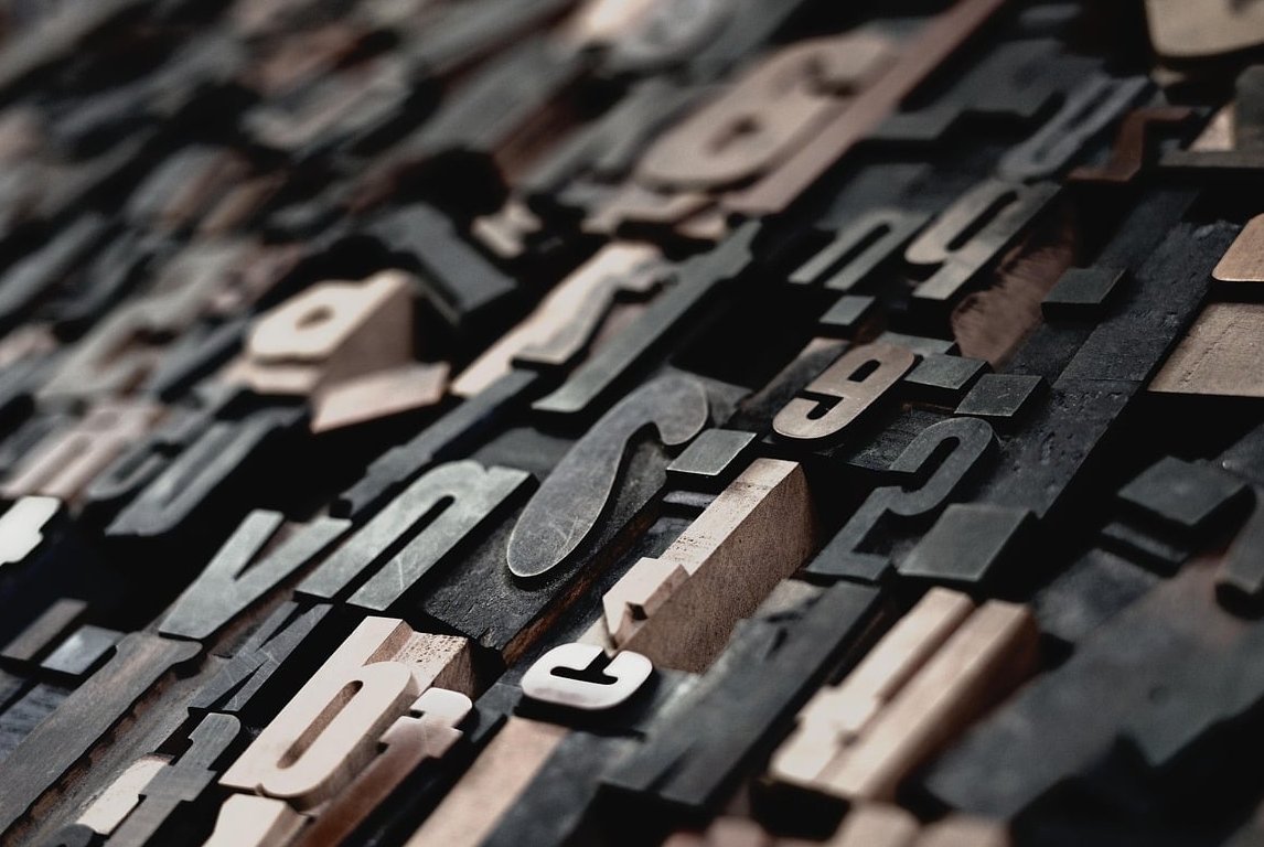
Choosing the right typeface is hard. Pairing two of them is even harder. A great font combination can elevate a brand from forgettable to iconic, while a poor one can sink an otherwise beautiful design. At Cantonax, we work with typography every day, and we have learned that successful pairings are not random. They follow clear principles that anyone can apply.
In this guide, we will walk you through how to pair fonts using 12 combinations that consistently work, explain the reasoning behind each one, and give you a practical framework you can use on your very next project.
The Core Principles of Font Pairing
Before jumping into the combinations, you need to understand the four principles that guide every successful pairing:
- Contrast: Pair fonts that are visually different enough to create hierarchy. Avoid two fonts that look almost the same but not quite, that creates visual tension without purpose.
- Hierarchy: One font leads (usually the headline), the other supports (usually the body). Decide which is which before you start.
- Mood matching: Both fonts should share a personality, even if they look different. A playful display font does not belong with a stiff industrial sans.
- Limit yourself: Two fonts is the sweet spot. Three is the maximum. Anything beyond that and your design starts to feel chaotic.
The Serif and Sans-Serif Logic
The most reliable pairing strategy in graphic design is combining a serif with a sans-serif. Why? Because they offer natural contrast while complementing each other:
- Serifs (like Garamond, Playfair, Merriweather) feel traditional, editorial, and elegant.
- Sans-serifs (like Helvetica, Inter, Montserrat) feel modern, clean, and neutral.
Use the serif for headlines when you want personality and the sans-serif for body text when you want readability, or flip it for a modern editorial feel.
12 Font Pairings That Always Work
1. Playfair Display + Source Sans Pro
Best for: Editorial, fashion, luxury blogs
Playfair Display brings high-contrast elegance to headlines, while Source Sans Pro is one of the most readable sans-serifs available. The combination feels expensive without being intimidating.
2. Montserrat + Merriweather
Best for: Corporate websites, startup landing pages
Geometric sans for the headline, classic serif for body. This pairing balances modernity with trust, which is why it remains popular for SaaS and B2B brands.
3. Bebas Neue + Lora
Best for: Magazines, sports brands, bold marketing
Bebas Neue is condensed and impactful, perfect for shouting. Lora softens it with calligraphic warmth in the body copy.
4. Inter + Inter
Best for: Tech products, dashboards, minimal interfaces
Yes, you can pair a font with itself. Use different weights (Inter Bold for headlines, Inter Regular for body) to create hierarchy without introducing a second typeface. This is the cleanest approach in modern UI design.
5. Oswald + Open Sans
Best for: News sites, blogs, content-heavy platforms
Oswald gives headlines a strong vertical rhythm, while Open Sans handles long-form text without fatigue.
6. Cormorant Garamond + Proxima Nova
Best for: Boutique brands, wedding designers, lifestyle
Cormorant feels romantic and refined. Proxima Nova grounds it with contemporary clarity.
7. Archivo Black + Roboto
Best for: Bold portfolios, agencies, creative studios
Heavyweight headline meets neutral workhorse. Great for designers who want their headlines to dominate.
8. Libre Baskerville + Montserrat
Best for: Personal blogs, online courses, knowledge platforms
The serif provides authority and the sans provides accessibility. A safe but never boring combination.
9. Abril Fatface + Lato
Best for: Fashion, beauty, lifestyle e-commerce
Abril Fatface is dramatic and feminine. Lato is warm and approachable. Together they feel like a glossy magazine spread.
10. Space Grotesk + IBM Plex Serif
Best for: Tech-forward brands, AI startups, design tools
This pairing has become a 2026 favorite. Space Grotesk feels current and slightly quirky, while IBM Plex Serif adds intellectual weight.
11. Futura + Garamond
Best for: Architecture, museums, premium publications
A timeless pairing. Futura’s geometric purity contrasts beautifully with Garamond’s humanist warmth. Used by countless iconic brands for decades.
12. Poppins + Playfair Display
Best for: Modern personal brands, coaches, consultants
Friendly geometric sans with elegant serif headlines. Approachable and aspirational at the same time.

Quick Reference Table
| Pairing | Mood | Best Use Case |
|---|---|---|
| Playfair + Source Sans | Elegant | Editorial |
| Montserrat + Merriweather | Trustworthy | Corporate |
| Bebas Neue + Lora | Bold | Magazines |
| Inter + Inter | Minimal | Tech / UI |
| Space Grotesk + IBM Plex Serif | Modern | AI Startups |
| Futura + Garamond | Timeless | Premium |
Common Mistakes to Avoid
- Pairing two decorative fonts: They will fight each other. Always anchor a decorative font with a neutral one.
- Choosing fonts that are too similar: Two geometric sans-serifs from different families often feel like a mistake rather than a choice.
- Ignoring readability: A beautiful headline font is useless if the body copy is hard to read at small sizes.
- Using too many weights: Stick to two or three weights per font maximum.
How to Test Your Font Pairings
- Write a real headline and real body copy, never use lorem ipsum for final decisions.
- Check the pairing at three sizes: large headline, mid subheading, small body.
- View it on both desktop and mobile.
- Step away for an hour, then return with fresh eyes.
- Ask someone outside the project for their gut reaction.
FAQ
How many fonts should I use in a design?
Two is ideal. Three is the absolute maximum, and only when each one has a clear distinct role (for example: headline, body, and accent).
Can I pair two serif fonts together?
Yes, but with care. Make sure they have strong contrast in weight, proportion, or style. A modern serif like Playfair pairs well with a humanist serif like Lora.
What is the safest font pairing for beginners?
A serif headline with a sans-serif body, such as Merriweather with Montserrat. It is nearly impossible to make this combination look bad.
Should the headline font or body font be more decorative?
Almost always the headline. The body font should prioritize readability above all else.
Are Google Fonts good enough for professional design?
Absolutely. Many of the pairings listed here use Google Fonts, and they are used by major brands worldwide. The free and accessible nature of Google Fonts has made them an industry standard.
Final Thoughts
Mastering how to pair fonts is less about memorizing combinations and more about understanding the logic behind contrast, hierarchy, and mood. Start with the 12 pairings above, apply them to real projects, and over time you will develop the instinct to create your own winning combinations.
If you need help building a brand identity with typography that truly reflects who you are, the team at Cantonax is here to help.