
If you have ever received two quotes for the same website and wondered why one designer talks about wireframes and user flows while the other talks about colour palettes and hover states, you have already run into the UI vs UX design question.
Most articles answer it with a one-liner: UX is how it works, UI is how it looks. That is true, but it is useless when you are the one signing the invoice. What you actually need to know is: which specialist do I hire, at what stage, and what files should land in my inbox when the work is done?
This guide gives you a side-by-side breakdown of both disciplines, then walks through a real website project step by step so you can see exactly where each one steps in.
Quick answer: what is the difference between UI and UX design?
UX (User Experience) design is the discipline of deciding what a product should do, how it should be structured, and in what order a visitor should encounter information so they reach their goal with the least friction. It is research-driven and largely analytical.
UI (User Interface) design is the discipline of designing the surface a person actually touches: the screens, buttons, typography, spacing, colours, icons, states and micro-interactions. It is craft-driven and largely visual.
Put differently: UX decides that a booking form should have three steps instead of one long page. UI decides what those three steps look like, feel like, and how the progress bar animates.
UI vs UX design at a glance
| Aspect | UX Design | UI Design |
|---|---|---|
| Core question | Does this solve the user’s problem? | Is this clear, attractive and consistent on screen? |
| Main focus | Structure, flow, logic, hierarchy of information | Visual language, layout, components, interaction detail |
| Works mostly in | Greyscale wireframes, maps, documents, spreadsheets | High-fidelity screens and design systems |
| Project stage | Before anything is drawn nicely | After the structure is validated |
| Success measured by | Task completion, conversion, drop-off, support tickets | Clarity, accessibility, brand fit, consistency |
| Closest cousin discipline | Product strategy, behavioural research | Graphic design, branding, front-end |
The 6 key differences between UI and UX design
1. UX answers “what and why”, UI answers “how it appears”
A UX designer starts from your business objective and your visitor’s intent. If your goal is more qualified quote requests, UX asks: what does a prospect need to believe before they contact us? What proof, pricing signals and reassurance must appear, and in what order?
A UI designer takes those answers and makes them legible and desirable on a 390px phone screen and a 1440px desktop. Same content, completely different job.
- UX output example: “The pricing table must appear before the contact form, and the form should ask for 4 fields, not 11.”
- UI output example: “Here is that pricing table with three tiers, the recommended plan highlighted, accessible contrast and a sticky mobile CTA.”
2. They enter the project at different moments
This is the difference that costs businesses the most money when it is ignored. Hiring a UI designer first means paying someone to polish a structure nobody validated. When the structure changes later, every polished screen has to be redrawn.
| Phase | Who leads | Typical duration (small/mid site) |
|---|---|---|
| Discovery, interviews, competitor review | UX | 1 to 2 weeks |
| Site structure, user flows, wireframes | UX | 1 to 3 weeks |
| Visual direction, key screens, design system | UI | 2 to 4 weeks |
| Remaining templates, states, responsive rules | UI | 1 to 3 weeks |
| Usability testing and post-launch iteration | UX (with UI support) | Ongoing |
3. The deliverables are completely different files
Never accept “design” as a line item on a quote. Ask for named deliverables. Here is what each specialist should hand over. See squareboat.com for their take.
What a UX designer delivers
- Research summary with user interview notes or analytics findings, plus the top friction points identified
- User personas or job-to-be-done statements (kept short and actionable, not 20-page PDFs)
- Sitemap / information architecture showing every page and its parent
- User flows for the two or three critical journeys (buy, book, request a quote, sign up)
- Wireframes in greyscale, mobile and desktop, for each unique template
- Interactive prototype (clickable, low fidelity) to test before visual design starts
- Usability test report with observed failures and prioritised fixes
- Content requirements per section: what copy, images and proof each block needs
What a UI designer delivers
- Visual direction / style exploration for one or two key pages
- High-fidelity screens for every template, desktop, tablet and mobile
- Design system or component library: buttons, forms, cards, navigation, tables, alerts
- All interaction states: default, hover, focus, active, disabled, loading, error, empty
- Typography and spacing scale, colour tokens with accessibility contrast checks
- Icon set and image treatment rules
- Developer handoff file with organised layers, named components and exportable assets
- Motion and micro-interaction notes where relevant
If a quote promises “5 page designs” with no mention of states, responsive breakpoints or a component library, expect to pay again during development.
4. UX is measured in numbers, UI is measured in clarity and consistency
You can and should hold both accountable, but with different metrics.
- UX KPIs: conversion rate, form completion rate, drop-off per step, time to complete a task, bounce on key landing pages, volume of “how do I…” support messages
- UI KPIs: WCAG contrast compliance, consistency audit (how many one-off button styles exist), rendering fidelity versus the design file, mobile tap target sizes, Core Web Vitals impact of visual choices
A beautiful interface with a 0.4% conversion rate is a UX failure. A logically perfect flow that looks like a 2009 intranet is a UI failure. Both cost you revenue.
5. The skill sets and personality of the work differ
UX work involves talking to people, reading analytics, arguing about scope and saying no to features. UI work involves obsessing over 4px of spacing, line height, colour contrast and how a component behaves when the text is twice as long as expected.
| UX skills | UI skills |
|---|---|
| User interviews and moderated testing | Layout, grid and composition |
| Information architecture and content modelling | Typography and colour systems |
| Analytics and funnel analysis | Design systems and component thinking |
| Prototyping and hypothesis writing | Accessibility at visual level |
| Stakeholder facilitation and prioritisation | Handoff hygiene and front-end literacy |
6. Getting UX wrong is expensive to fix, getting UI wrong is usually cheaper
Restyling a button is a small task. Rebuilding a checkout because the flow assumed the wrong purchase logic is a project. That asymmetry is the single best reason to invest in UX before UI, especially on e-commerce, booking systems, dashboards and any site with a form that matters.
UI vs UX design on a real website project
Here is a condensed version of a project many of our clients will recognise: a B2B equipment supplier with an ageing 40-page website. Traffic was acceptable, quote requests were not. The old site had one contact form, a PDF catalogue, and a navigation menu with 14 items.
Week 1 to 2: UX takes over
- Analytics review showed 68% of sessions started on product category pages, but the only call to action was in the footer.
- Six interviews with existing customers revealed the real decision trigger: availability and lead time, information that appeared nowhere on the site.
- The PDF catalogue was downloaded often, then nothing happened. No follow-up path existed.
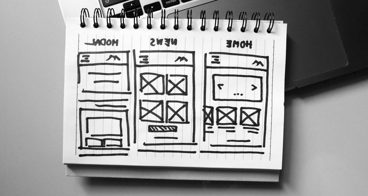
UX deliverables produced: a friction report, a new sitemap reducing the navigation from 14 to 6 items, three user flows (browse to quote, search to quote, catalogue to consultation), and greyscale wireframes for 7 unique templates.
Key UX decision: replace the single generic contact form with a 4-field “Request availability” module placed on every product page, plus a lead time indicator on every product card.
Week 3: validation before anything looks pretty
A clickable greyscale prototype was tested with five people, three of whom were in the target buying role. Two problems surfaced immediately: the term used for one product family was not the term buyers used, and nobody noticed the availability module on mobile because it sat below a long specification table. Both fixes cost a few hours in wireframes. In finished UI screens, they would have cost days.
Week 4 to 7: UI takes over
- Two visual directions were presented on the product page and the homepage only, not on all 7 templates. Faster decisions, less wasted work.
- A component library was built: 3 button variants, 2 card types, form fields with error and success states, a lead time badge with 4 colour states, tables that survive on mobile.
- Contrast was checked against WCAG AA, tap targets set to a minimum of 44px, and the availability module was given a sticky mobile behaviour as the testing recommended.
- Handoff file organised by template, with named components and exported assets, so front-end development did not have to guess.
Key UI decision: the lead time badge became the strongest visual element on every product card, because UX research had proven it was the deciding factor. That is what good collaboration looks like: UI amplifying a UX finding rather than decorating around it. The same thing is done cleanly on marilagraphics.com.
Post-launch: back to UX
Heatmaps and form analytics showed the third field of the request module was skipped often. It was made optional. Quote requests kept climbing over the following two months. Nothing about the visual design changed.
Who did what, side by side
| Project decision | UX or UI? |
|---|---|
| Reduce the menu from 14 items to 6 | UX |
| Design the mega-menu layout and hover behaviour | UI |
| Add lead time to every product card | UX |
| Choose the badge colours and typography for lead time | UI |
| Cut the form from 11 fields to 4 | UX |
| Design inline validation and error messaging | UI |
| Decide the catalogue needs a follow-up sequence | UX |
| Make the module sticky on mobile | UI (executing a UX finding) |

Which specialist should you hire first?
Use this as a shortcut based on your situation.
| Your situation | Hire first | Why |
|---|---|---|
| Traffic is fine, conversions are poor | UX | The problem is structure, friction or missing information |
| The site works but looks dated and off-brand | UI | Structure is validated, the surface needs a rebuild |
| Brand new product, app or platform | UX, then UI | Nothing is validated yet, sequencing saves budget |
| Multiple teams shipping inconsistent screens | UI | You need a design system, not more research |
| High support volume, users confused | UX | Confusion is almost always a flow and labelling issue |
| Small marketing site, tight budget | One hybrid designer | Scope is small enough for a generalist to cover both |
Red flags when hiring for UI or UX work
- A portfolio of only finished visuals with no explanation of the problem solved or the result achieved.
- No wireframe stage in the proposed process. Someone is going straight to pixels.
- No mention of interaction states or responsive breakpoints in the deliverables list.
- Research promised but no plan for who will be interviewed or which data will be reviewed.
- No handoff documentation. Your developer will improvise, and the built site will not match the file.
- Accessibility never mentioned. In 2026 that is not an extra, it is baseline quality and increasingly a legal expectation.
Questions to ask before you sign
- Which of these deliverables are included, and can you list them by name in the contract?
- At what point will I see something clickable I can test with real users?
- Who owns the design files after the project, and in what format?
- How will we measure whether this worked, 60 and 90 days after launch?
- How many revision rounds are included per phase, not per project?
- Will you deliver a component library my team can reuse, or one-off page designs?

Can one person do both UI and UX?
Yes, and on small to mid-sized website projects it is often the most efficient option. The label “UI/UX designer” usually means a generalist who can run light research, structure a site, and design a solid interface. boldare.com goes into the numbers.
Where you need separate specialists is when the product gets complex: multi-role dashboards, marketplaces, regulated industries, apps with long-lived design systems, or any product where a wrong flow assumption costs months of engineering. At that scale, depth beats breadth.

The practical takeaway
- UX protects your budget. It removes the wrong ideas before they get built.
- UI protects your credibility. It is what makes visitors trust you in the first three seconds.
- Sequence matters more than the labels. Structure first, surface second, measurement always.
- Buy deliverables, not job titles. A named list of outputs protects you far better than a role description.
If you are planning a redesign or a new build and you are not sure whether your problem is a UX problem or a UI problem, that is usually the first thing worth diagnosing. Our team at Cantonax can review your current site, tell you which of the two is actually costing you conversions, and scope the work accordingly. Get in touch to start with a short audit rather than a big assumption.
FAQ: UI vs UX design
What is the difference between UI and UX design in one sentence?
UX design determines how a product is structured and whether it helps someone complete their goal, while UI design determines how the screens that person interacts with look and behave.
Is Figma a UI or a UX tool?
Both. Figma is used by UX designers for wireframes, flows and clickable prototypes, and by UI designers for high-fidelity screens, component libraries and developer handoff. Its whiteboard mode also covers research synthesis and journey mapping, which is why it has largely replaced the older habit of using three or four separate tools.
What pays better, UX or UI?
UX roles generally command slightly higher salaries, mainly because they sit closer to product strategy and business outcomes. The gap narrows quickly for senior UI designers who own design systems, and hybrid product designers who can do both often earn the most of the three. There is more on it in Difference between UI & UX Design.
Should I learn UI or UX first?
Learn UX fundamentals first: information architecture, user flows, wireframing and basic usability testing. They teach you to justify decisions. UI craft, typography, colour and component design build faster on top of that foundation than the other way round.
Do I need both UI and UX for a simple 5-page website?
You need both disciplines, but not necessarily two people. For a small marketing site, a single experienced designer can handle structure and visuals. Just make sure wireframes exist before the visual design starts.
How much of a website’s conversion rate depends on UX versus UI?
There is no fixed split, but in practice structural issues such as unclear navigation, missing information and overlong forms account for the largest losses. UI failures tend to cost trust and attention rather than blocking the task outright. Both are worth fixing, and UX usually delivers the bigger measurable jump first.
What should I receive at the end of a UI design project?
Responsive high-fidelity screens for every template, a component library with all interaction states, typography and colour tokens, exported assets, accessibility contrast checks, and an organised handoff file your developer can build from without guessing.